
S&P Global — FutureChoice.AI
Interactive installation asking people to weigh progress, policy, and planetary impact in our rapidly evolving AI landscape.
We are not bound by format or technology. Our outputs effortlessly adapt to digital, physical or virtual spaces—always in service of the most persuasive storytelling possible.

Interactive installation asking people to weigh progress, policy, and planetary impact in our rapidly evolving AI landscape.
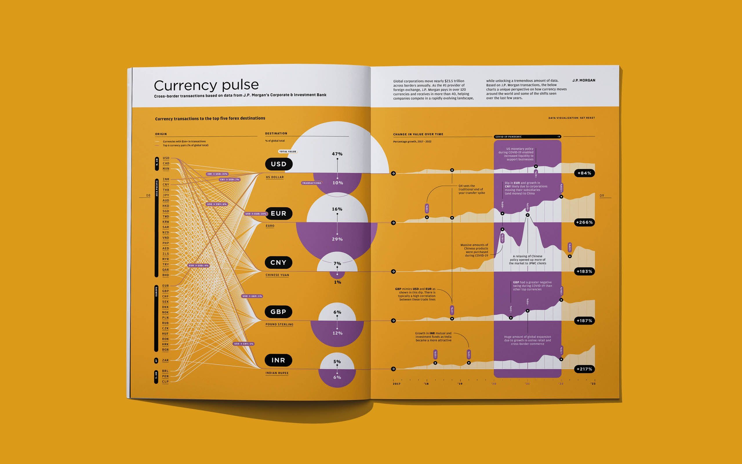
Printed data visualisation mapping the top five destinations for cross-border forex transactions. Featured in Payments Unbound magazine issue 3.
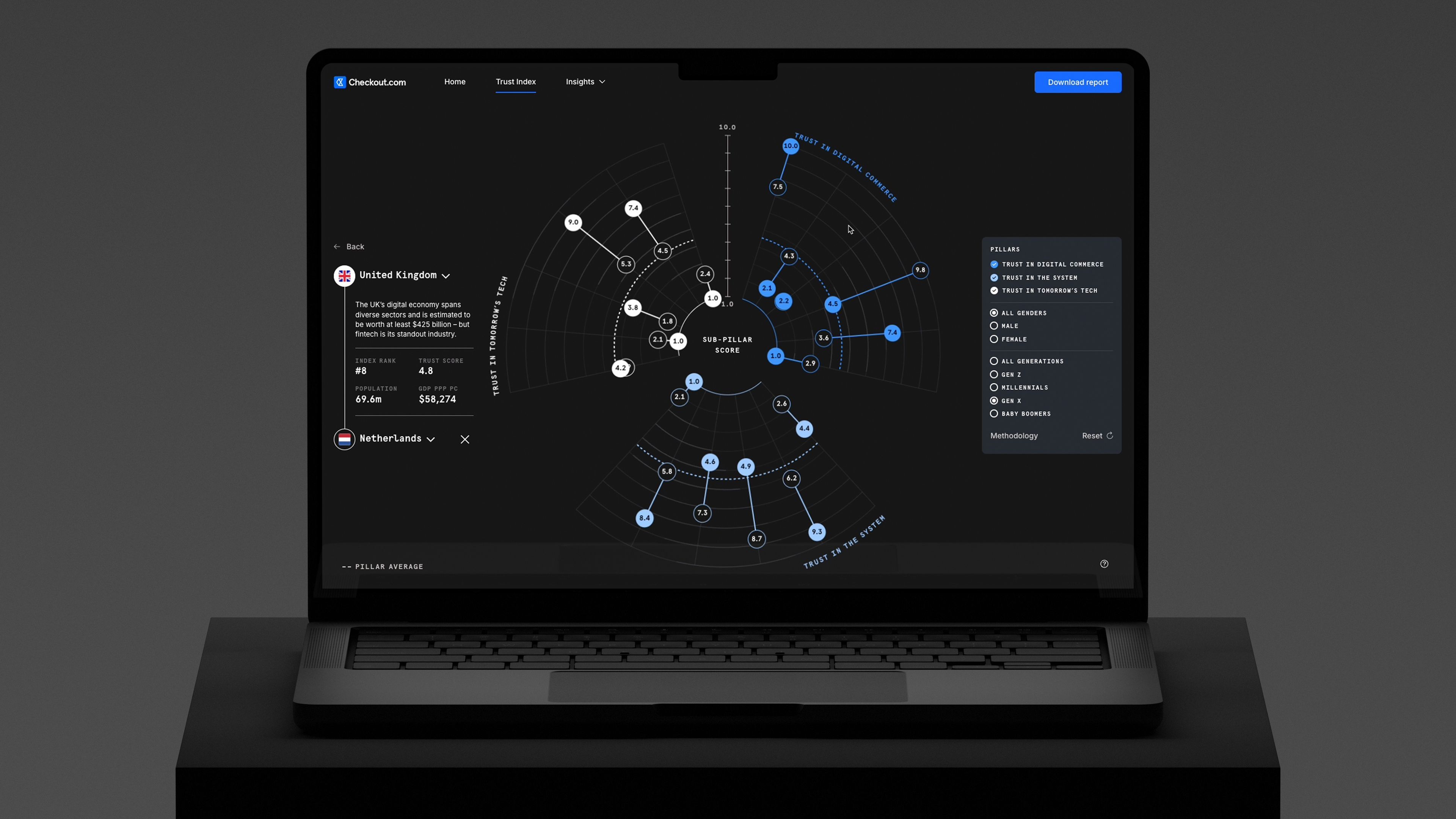
Data-led experience exploring how trust shapes the digital economy today and how it may evolve in the future.

Interactive, generative, big-screen data visualisation charting real-time opinions around the future of bio-technology. Exhibited at BIO 2023.
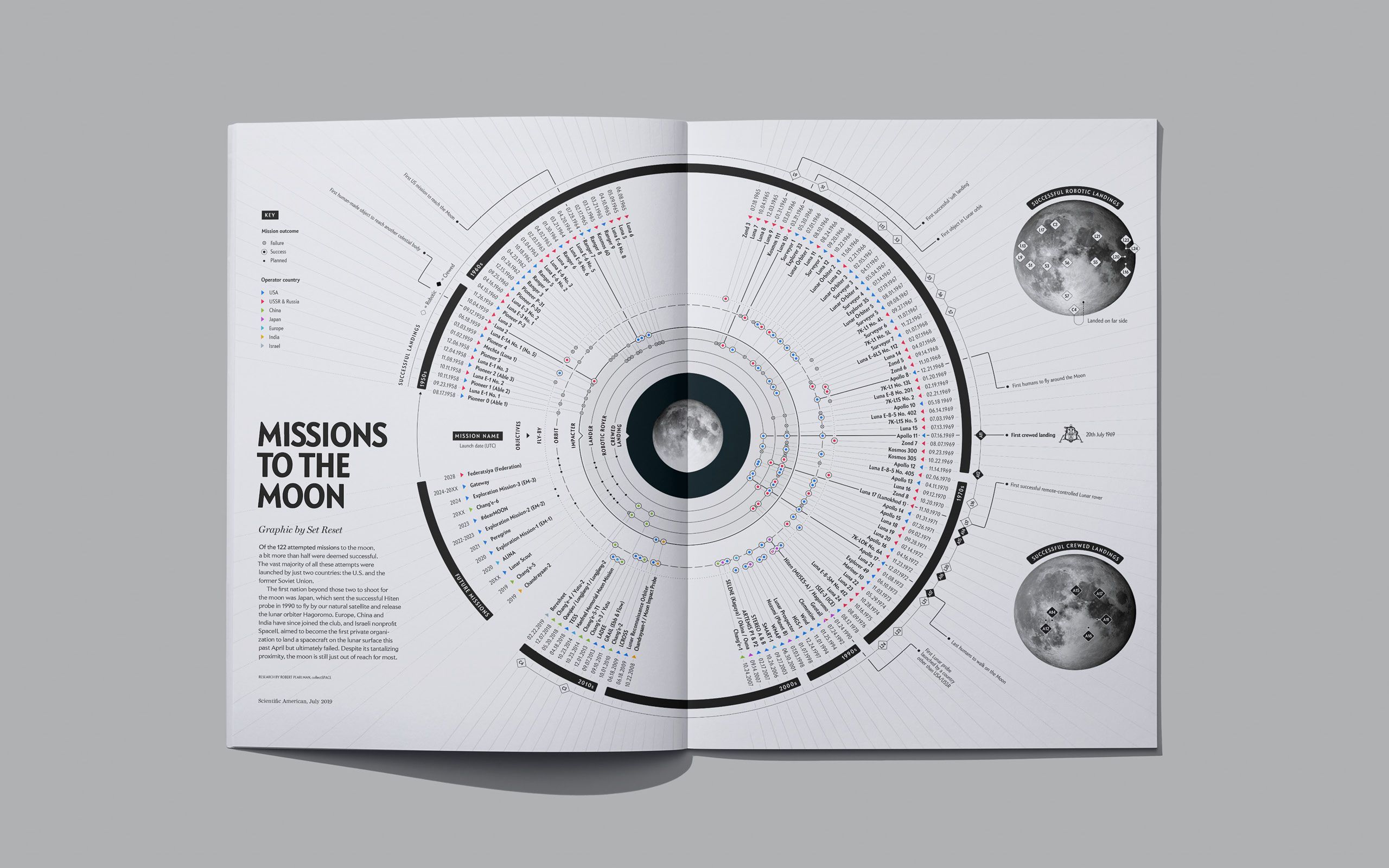
Printed data visualisation charting every past and future moon mission by date, origin, and mission status.
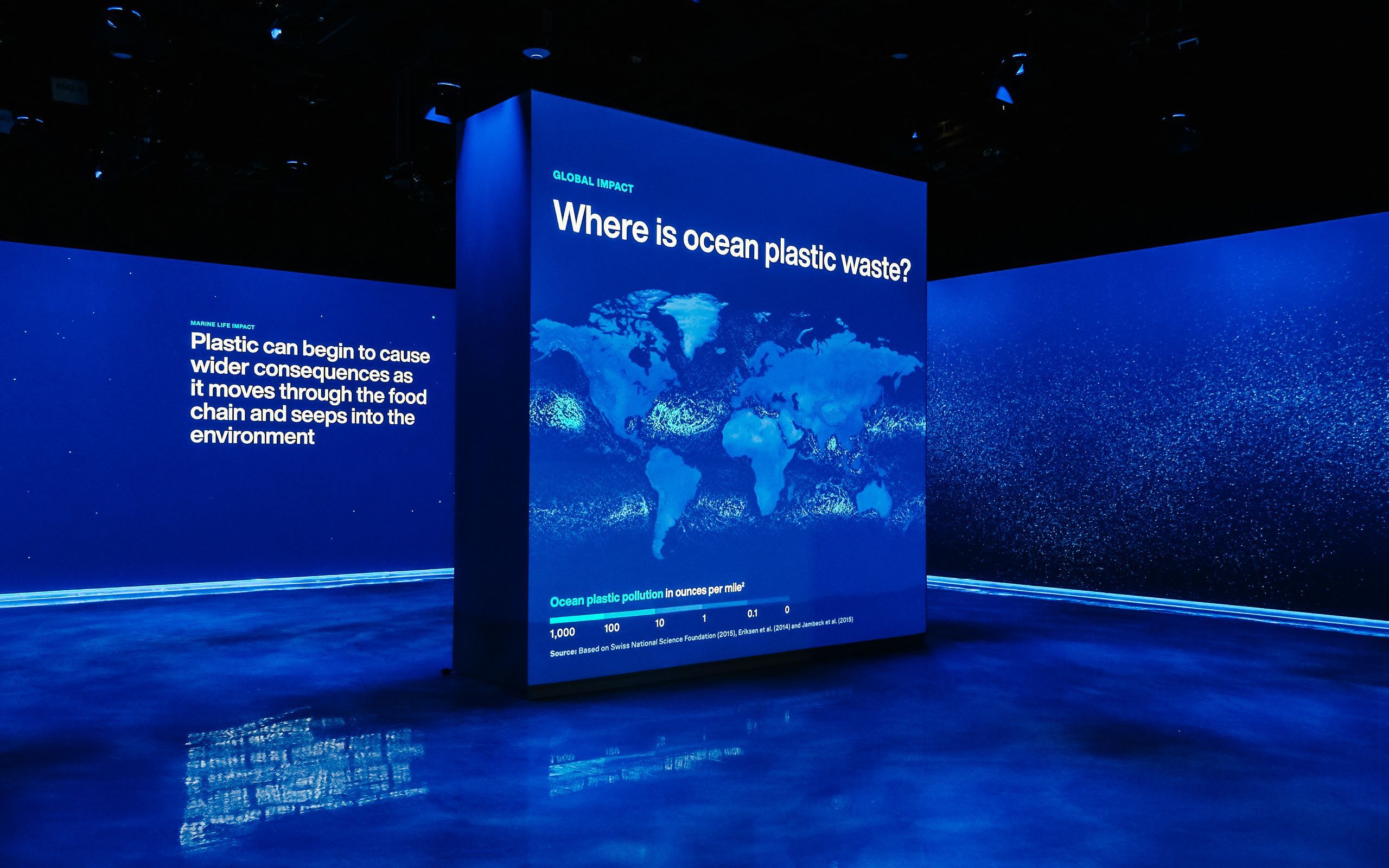
Immersive, motion-sensitive, multimedia experience showing the disastrous impact of plastic in our oceans. Permanent exhibit in the Museum of Science and Industry, Chicago.
Design and development of a high-fidelity interactive prototype showcasing the transformative potential of the WHO's global data hub.
Explainer animation showcasing Refintiv's FX products and demystifying the intricacies of the FX trade workflow.

Brand refinement, animation and information design for next-generation Crypto-enabled global payments platform.
Immersive animated experience exploring the rich data behind NYC and the people that live there. Exhibited at Iron 23 in the Flatiron Flatiron District NY, September 2022.

Brand identity, website and information design for next-generation services company specialising in cloud-based data architecture and engineering.

Fine art data visualisation screen-print mapping NASA's Apollo program, one of humanity’s most awe-inspiring endeavours.
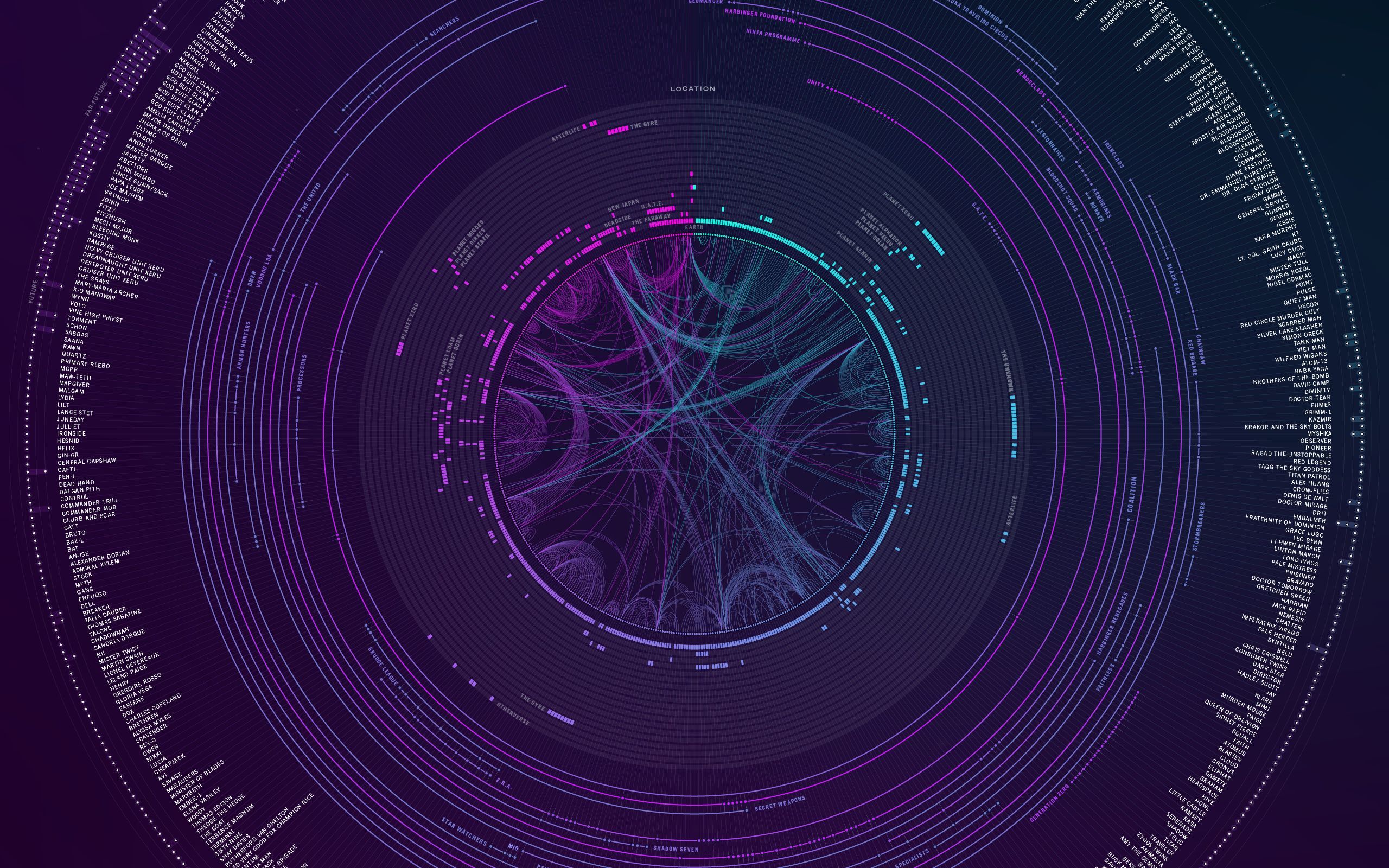
Data-driven odyssey through the last great comic book franchise, where every character, conflict, and corner of the cosmos is meticulously mapped and encoded.

Brand identity, website, pitch deck and lite-paper for a next-generation network for the NFT ecosystem.
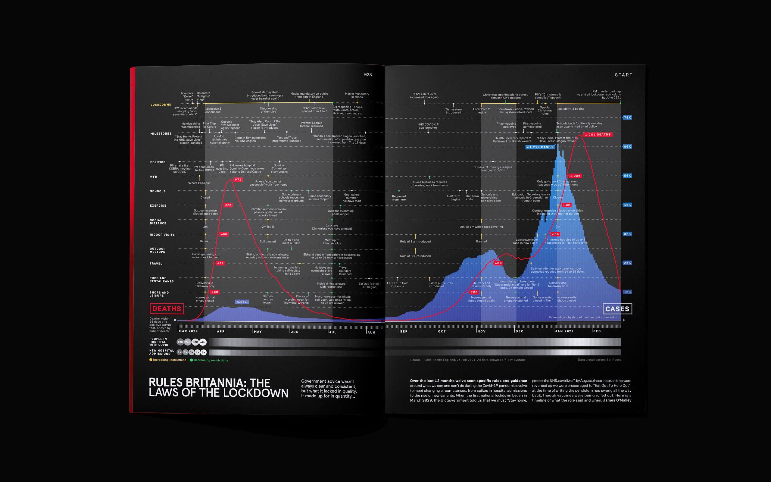
Editorial data visualization untangling the ever-evolving web of British Covid-19 laws and regulations through two lockdowns.
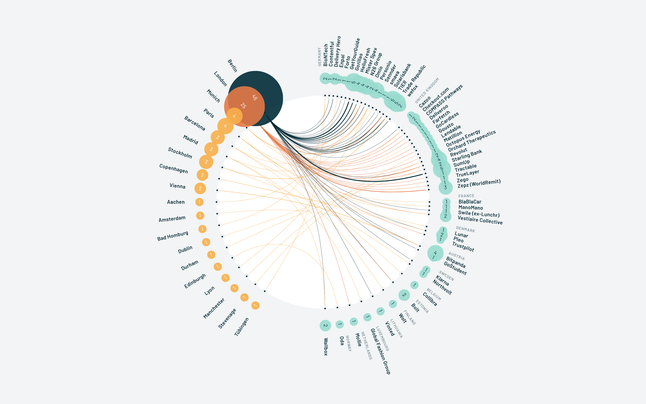
Series of data visualisations illustrating Europe’s position as a global tech player in 2021.
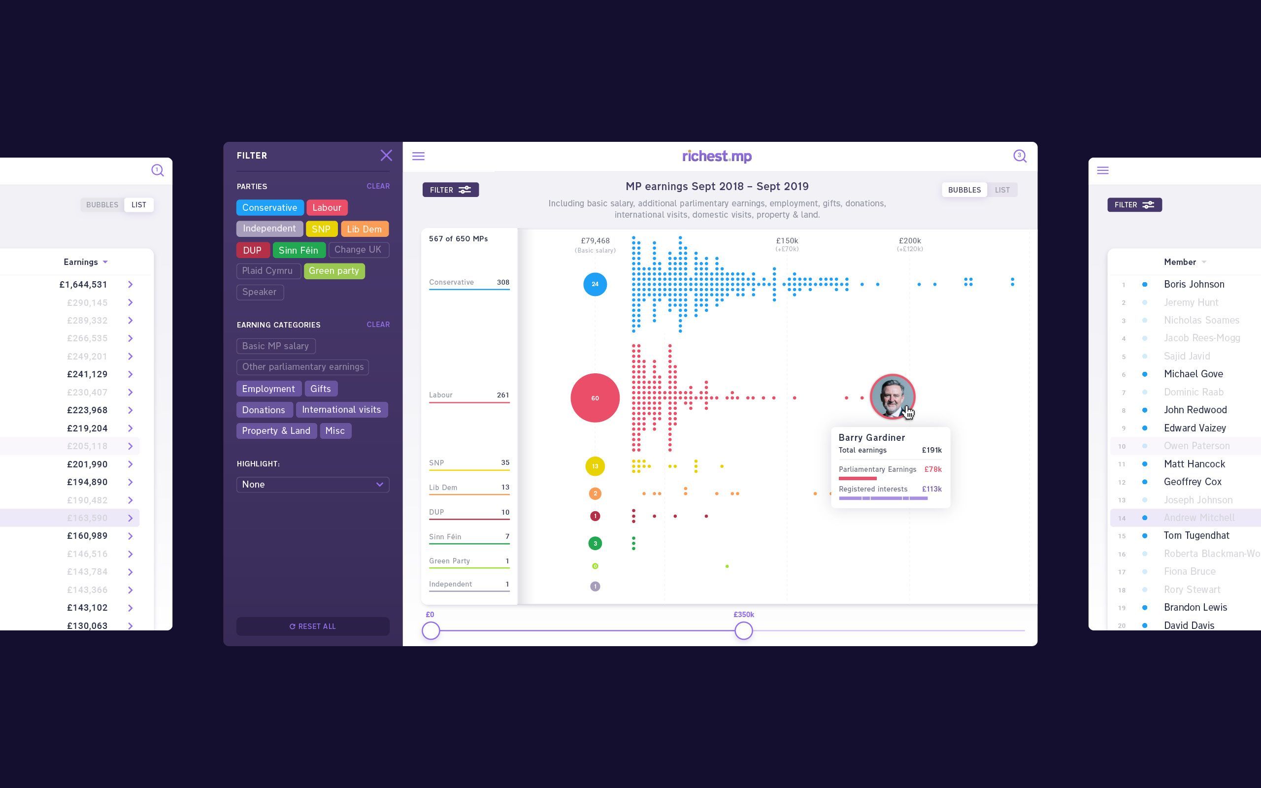
Interactive tool and data visualisation highlighting MP’s additional earnings and sources of income.

Animated explainer introducing a data architecture, strategy and innovation consultancy.
AI-driven experiment exploring new ways to exhibit and experience physical art in the digital space.
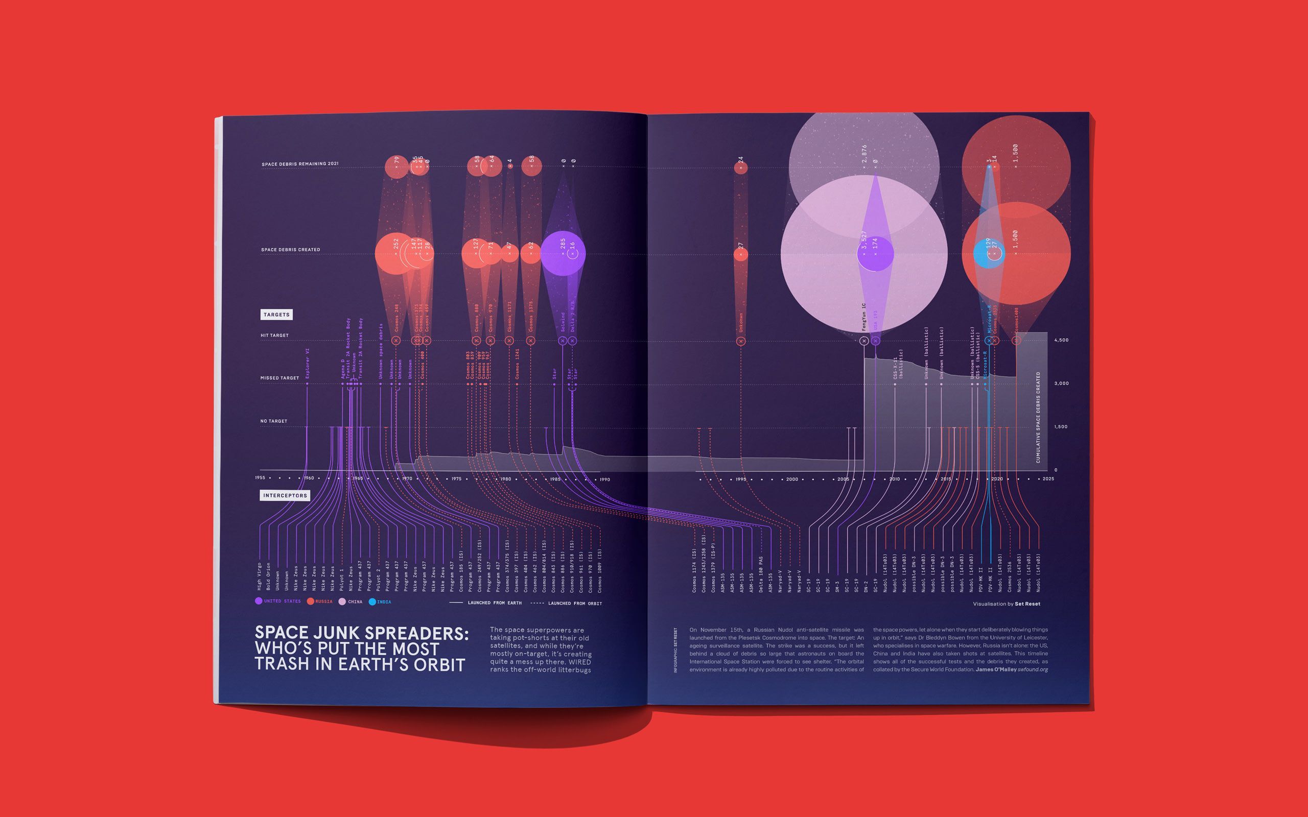
Editorial data exploration charting the history of anti-satellite tests and their lasting debris in orbital space.
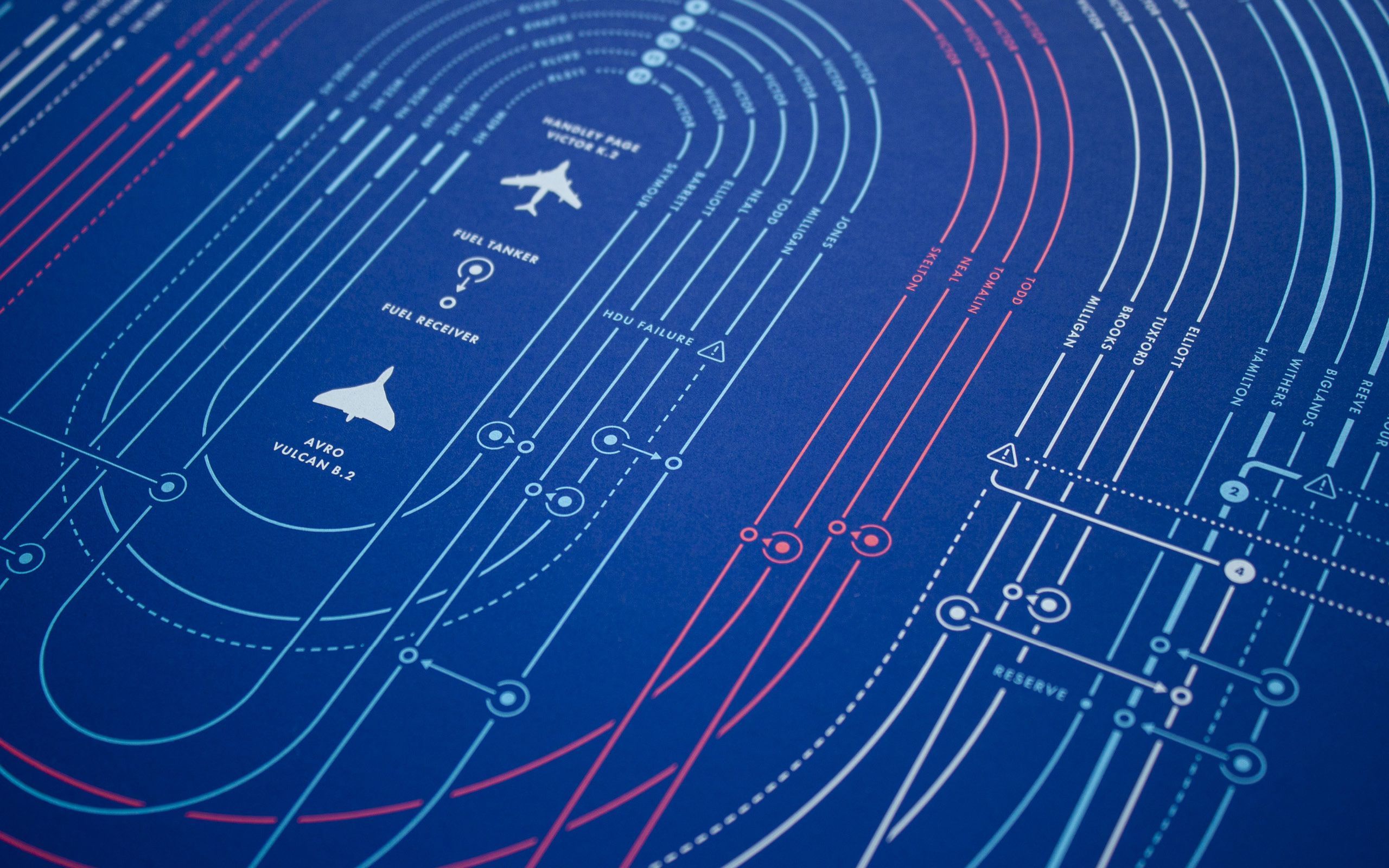
Screen-printed poster telling the story of Operation Black Buck, a remarkable mission during the Falklands War.
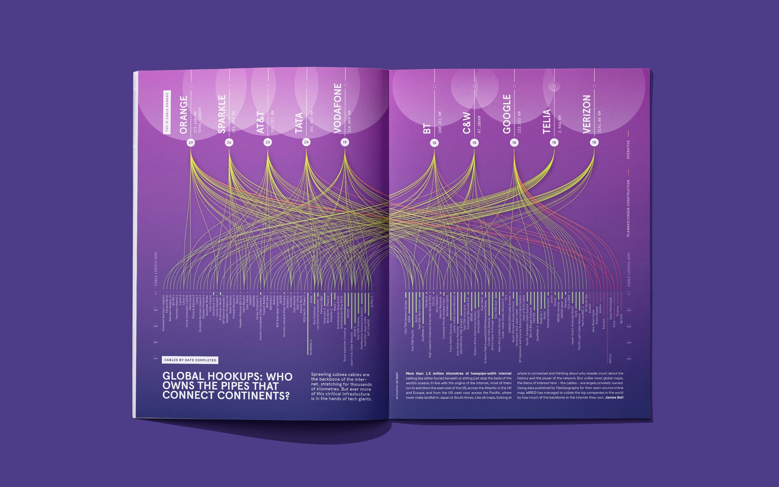
Editorial data visualisation exploring 1.5 million km of subsea cables and the 10 tech giants who own them.

Animated explainer telling the story of Arrival’s innovative decentralised manufacturing process.